This is my learning log for the OCA Digital Film Production - Creative Concepts Course
Monday, 30 July 2012
Project 9 Light and Colour
Exercise: Reflected light
Rather than repeat the exercises I did last year for Art of Photography, I will post the link to my TAoP blog:
http://rjdown-taop-log.blogspot.co.uk/2011/10/part-4-lightproject-photographic_09.html
During my projects and assignments, if I find new lighting effects and solutions to problems, I will record them in this blog.
Wednesday, 25 July 2012
Project 8: Balance
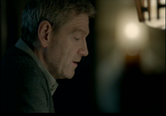
Viewing: I chose to watch an episode of Wallander to find the examples listed in the course notes.


These two images demonstrate the rule of thirds, Kurt’s eye line is on the intersection and he is looking to the left of the camera position; “look room”. In the second frame, the car travels along the road in the background from right to left, turns into the centre of the frame and swings round and stops on the intersection of thirds bottom left. This is quite an interesting device which gives the car some time in the frame to establish the change of location.
I have included this frame for its use of light and shadow to create depth in the scene. From within the crime scene we see the car pull up outside. There is just enough space through the broken window to show Wallander climbing from the car and the dark shadow on the left suggests menace or the unknown waiting for the detectives’ insightful mind to enlighten the viewer.
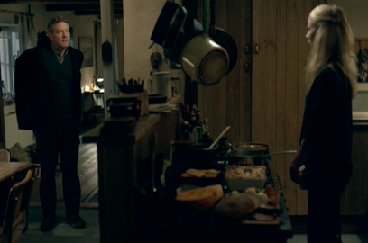
This frame is the establishing scene for a dialogue between Kurt and his daughter Linda as they sit down for a meal.
The conversation starts amicably and the balance is typical with the figures to left and right of their respective frames.

As the discussion becomes more heated, both figures are shown in the frame. There are some important gestures which need to be shown from both characters.

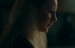
These frames are in the order shown. At the height of the argument, the framing changes so that both characters appear to be back to back until Linda declares that they should not be arguing but concentrating on the search for her missing friend Anna when the sequence returns to the normal left right framing of the dialogue.

In this frame, Kurt is entering a farmhouse to meet Anna. The balance gives “walk” room to the left and also a dark shadow, introducing tension as Kurt walks into the unknown.
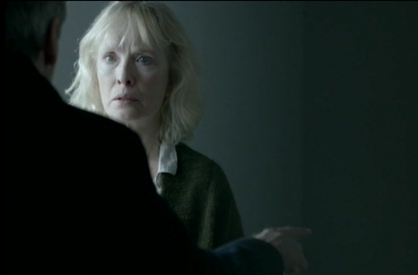
I thought this was an unusual use of an over the shoulder two shot. It is quite tight but very much to one side of the frame. Wallander is confronting Monika, Anna’s mother, with the effects of keeping the truth about Anna’s father’s suicide from her. The space to the right gives room for Kurt’s gestures while the strong side lighting on Monika's face enables the viewer to see her reaction to Kurt’s questions.
Conclusions: This was a good exercise and I have learned to look at framing and balance in a different way. I shall continue to watch films and learn more about composition, depth, balance and the meaning that can be inferred from their subtle combinations.
Sunday, 22 July 2012
Project 7: Depth - Images with Depth
Exercise: Images with Depth
Objective: I found the objective for this exercise a little confusing but I think I need to produce three images illustrating three of four atmospheres. Here is my first:
Dynamic/exciting/adventurous
These armoured personnel carriers drive up and down the main road near my house constantly. I have always thought it would be exciting to drive one myself. I made a couple of images to try and sum up something of how it may feel to hurtle down the road in a tracked vehicle.
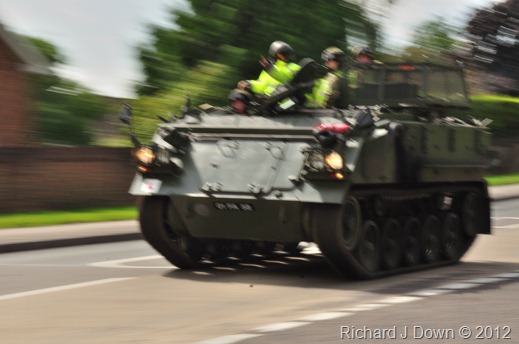
This was the first image I made using my DSLR. I kept to a slow shutter speed 1/25s to blur the action and give the impression of movement. That’s the stills photographer in me. The depth of field is not really relevant. (1/25s @ f32). There are a lot of diagonals here which add to the dynamism.
The equivalent moving image would hopefully keep the tank in focus as the pan blurs the background. Even though I panned this on a monopod it’s not as sharp as I expected but it still works. The sound is also very loud.

This one was easier to photograph as it was on the other side of the road. This would be the frame for the start of a shot. I chose a point a which the sun was lighting the front of the vehicle, I have included a lot of diagonals and the lens was set at 105mm so this is a medium telephoto shot. Thinking about the moving image, I would probably use a shorter focal length and not alter the zoom as I panned right. the exposure setting is 1/500s @ f6.8. I think this could be a good exercise in panning – I’ll give it a try on the next driver training day that coincides with my morning off. I think this works well. As moving images, these compositions will have depth.
Oppressive/dull/stifling
This is a picture of the scenery store backstage at the local theatre. It was made during the late evening with daylight coming from a high window above the stairway. I had it in mind that the sunlight would give layers of light which would emphasise the dull and oppressive foreground.

It is a small, narrow space with muted colours and dark shadows. I thought It would also work in monochrome but without the colours, the image is a bit flat. I am happy with the image, the placing of the objects in the foreground and background add to the depth created by the various colours and patches of light.

Refined/mature/reasonable
For the third image I visited the National Trust at Hinton Ampner where I was able to photograph a refined atmosphere. I have included two images, the first of which uses diagonal lines, foreground and background objects and light to differentiate different depths. I am happy that I have achieved what I set to do here.
My second image uses differential focus and light and shade to indicate depth. This dining room was lit only by window light from the left and lamps around the room. I chose to focus on the decanter and the narrow band including the first place setting on the left,.
- Probably the most successful way of creating depth in an image is using diagonals. If they converge, so much the better. Other ways, demonstrated above include the use of foreground and background objects, differential focus and layers of light and dark including the use of colours.
- Visual depth is very important to the overall feel of the shot, it can help to create atmosphere and mood, it can help tell you create and understand a character’s mood or mental state.
Tuesday, 17 July 2012
Viewing: The Conversation - 1972
Directed by Francis Ford Coppola – Supervising Film and Sound editor Walter Murch
After reading In the Blink of an Eye I was pleased when I found that the DVD of this movie had the option of a commentary by Walter Murch on how the film and the sound were edited. Although a lot of it was pretty standard stuff, I did make notes on a few of the more interesting techniques employed, some because of their historical context and others for their effect on the narrative.
A technique often employed at the start of a movie, the long shot slowly zooming in on the action to pick out central character was used here for the opening titles. New at this time (late 60s early 70s) was a programmable zoom which is capable of slow and precise change not possible by hand. The title sequence lasts 3 minutes and over that time the camera changes from a wide shot of Union Square in San Francisco to a wide shot (i.e. full body) of Harry Caul (Gene Hackman) a freelance surveillance technician, the main character in the story.
The conversation featured in the title and around which which the thriller is based, takes place immediately after the opening sequence and is replayed constantly through the film as the mystery deepens, seems to unravel and then deepens once again. The technique employed for shooting and acting this scene was unusual. The two characters having the conversation were afraid of being overheard so met in a public square and kept walking amongst the crowd so that they could not be overheard. Using 6 cameras (in,around and above the square) and new (but fairly crude by today’s standards) radio mikes they were filmed and acted constantly on the move with no control over the crowd or the diegetic sound. They acted the 6 minute scene over and over again which gave Murch more than enough material for his edits. Despite this, he still had to re-record the conversation in a quieter location to be able to reinsert sections that had not been clear from the radio mikes. It is interesting that Murch points out that if you can get good actors to repeat dialogue very soon after shooting, the timing and cadences of their voices will be almost identical to the original performance, enabling accurate syncing with footage. This is how he was able to replace the missing dialogue from the shoot.
Murch also points out some unusual footage that he was presented with, a static frame into which the character moves in and out. This was in Caul’s apartment, showing the lack of personal touches, indicating an aspect of his personality.
Another interesting feature was how the scenes showing Caul analysing and re-recording the conversation were cut. The plan was, for the whole process to be shown; including the revealing moment when the couple appeared express that they were in danger, to be shown in one scene. However it was felt that this would provide too much information to be processed by the viewer so the director developed the plot so that the “reveal” was shown in a subsequent analysis and recording after Caul had refused to hand over the tapes to a lackey of the client.
The narrative structure of the film is a thriller with a character study of loner Harry Caul, the narration restricted to that of Caul alone. The viewer only knows what Caul knows and at the conclusion of the film, there is still a lot that the viewer does not know, reflecting the attitude of Caul in that he does not want to know about the lives of his clients or those that he listens to, except in this case where he was involved on the periphery and learned too much. Murch describes it as a balance between the styles of Hitchcock and Hienrich Hess.
Wednesday, 11 July 2012
Exercise: Creating depth with lighting
Objective: To create at least three images giving distinctly different impressions of depth in the same space.
Using my small sitting room I have experimented with the effects of using different combinations of room lighting, basically by turning lights on and off, zooming in and out and looking at the effects.
I produced this contact sheet to work from, enabling me to select the most suitable images.
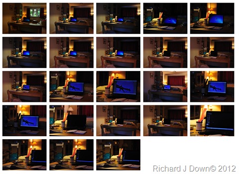

My first useful shot was a wide angle with two areas of lighting; the back wall and a table lamp on the desk. The laptop screen is lit. I can see a distinct separation between the mid ground and the back ground. Although the room is rectangular and the photograph is taken along the room, the camera position and the wide angle make the room seem square. There is one more light out of shot to the right, lighting the right side of the table and the floor. (The camera was mounted on a tripod in the same position for all of the subsequent shots. I’ve used my DSLR to record these images.)

Keeping the same camera position and angle of view, I switched off the background light at left and the light at mid right to give a greater separation of the two lit areas. This combination has produced a diagonal movement, making the room seem wider and as there is no light on the ceiling it has reduced the apparent height of the room.

For this shot I killed the lights in the background and to the right, leaving just the desk lamp to illuminate the scene. I zoomed in on the desk from the same camera position. Depending on the effect required, varying the exposure would make the dark background more visible. On my monitor I can see twilight just below the curtains and the shape of the lampshade just left of centre. Sufficient to show there is something there. The scene itself now looks a bit cluttered. The spill from the table lamp highlights the globe and the CD rack and the long focal length has compressed the scene markedly. (The blue cast from behind the camera in this scene comes from an un-curtained window behind me – dusk, overcast evening light)

This is the zoomed out version of the previous shot with the “mid” scene lit from the right as well as the table lamp. The back ground in now more distinct but not distracting. The light from the right gives a more open feel to the scene.

Finally, I switched off the “mid” scene lights and fully lit the background with the table lamps and the ceiling lights. This has the effect of pushing the rear of the scene back, making the room appear longer rather than square. The lit computer screen maintains a focal point for the mid ground while the foreground is rendered insignificant by the low light level.
Conclusion: I have made a lot of images and tried a lot of combinations of lights. I think I have demonstrated how to create depth using lighting. Like all photographic lighting, each situation requires a unique approach. I am becoming aware of how lighting is used to create space, atmosphere, colour, shape and simply as part of the composition of a frame.
Wednesday, 4 July 2012
Project 7: Depth
Exercise: Depth Although all of the principles of creating depth have been covered in the Art of Photography course blog, I thought it would be useful to include a “live” shot of the effect of zooming on depth of field in this section of my log.
I set up a long table with two objects along it for the short take. I started with the zoom set at approx. the mid point of its range, zoomed in and then out again. I found that I had to manually set the focus onto the nearest object otherwise it would not come into focus as I zoomed in. Autofocus tended to bring the far object into focus. This was probably due to the relative spacing of the objects but it was a worthwhile exercise and good practice. Another reason for shooting this frame is to get some use of my new editing software. I have changed from Nero to Sony Vegas for HD. I’m hoping it will be easier to use and enable me to manage my projects in the way I want to rather than the software dictating how and where I can save my files.
Exercise Depth from Richard Down on Vimeo.
Project: Mise - en–Scène Exercise: Spaces
Objective: Capture four shots that have a distinctly different feel about them.
1. An oppressive cluttered space.
My immediate thought on this first space was my rather untidy garden shed.

Cluttered certainly, oppressive (causing discomfort by being excessive, intense etc.) - it has a low ceiling, it is poorly lit and if you had to work or stay inside this building for any length of time it would be uncomfortable. I think this scene fills the brief well for an inside space, however, while I was out looking for other spaces I did come across this outside space that also fills the brief.

If I was looking for an outside location to give an air of oppression and a dark, sinister feeling. This would be it. This space would feed the imagination of the susceptible, dark shadows, restricted visibility and an eerie sound quality deadened by the soft carpet of fallen leaves.
2. An open, honest simple space containing one intriguing item.

This space is honest because it is where people are (the houses in the background) it is simple, the discarded shoe relates to the sense of a lived in space which in turn is non threatening. The sun is shining, there is blue sky between the trees and your immediate thought is about the shoe, who it belongs to and why is it there? There is no threat or perceived danger here. This is how I visualised the space and the shot. I think it is working well.
3. A stark, empty hostile space
This space was more challenging to find, especially in rural Hampshire in the middle of summer. I don’t have access to any interior spaces which are stark and hostile but I thought this wide low shot of an area of tarmac parade square in the centre of the MOD training area near my home would fit the brief.
It’s not quite empty but the dark trees and the heavy sky make it hostile. The trees may hide hidden dangers and the surface of the tarmac is hard and unforgiving. It feels cold and somewhere you want to get away from as soon as possible. 4. A warm, friendly cosy space.
Here, I have used an existing image from my TAoP blog exercise on lighting. A domestic scene which by the colour of its lighting shows a warm and friendly space. I’m sure it is cosy also ( snug, comfortable). I think the muted colours contribute to the cosiness and the small space is a snug one.

I was also keen to explore warmth and cosiness outside and thought that these sheep settled in the long grass, warming themselves after a squall of rain looked warm and cosy.

Conclusion: Setting a scene is an important part of the narrative process. The atmosphere or feeling you can create by carefully choosing or constructing the scene can save the need for lengthy explanation through dialogue. Our eyes take in and process a lot of information without us having to think about it. This not only applies visually. Think of a radio play and how simply a scene can be set just by the introduction of some very simple background sounds.
Subscribe to:
Comments (Atom)

